As a kid, my mom told me to never judge a book by its cover. That scary-looking man sitting on that park bench might be the nicest guy in the city, I was told. And that made sense to me. Unsurprisingly, I started to notice many exceptions to this rule as I grew up. I knew to steer clear of the guy wearing the sexually explicit t-shirt. The woman with a Donald Trump hat? Nope. Montreal Canadiens jersey? See ya!
But what about album covers? What’s the thought process of someone judging an entire album by that 12 cm by 12 cm image on the front side of the CD package? What about when they judge a cover by its album? All the time you hear of people whose favourite album features their favourite cover. And what makes a good album cover, anyway? There are answers to these questions.
Simply put, there are two factors that contribute to having the perfect album cover: whether the cover is aesthetically pleasing and whether it says something about the music behind it.
Aesthetically pleasing? You snob. You couldn’t possibly have the answers to such a loaded phrase, Alex.
I don’t. Whether a piece of art is aesthetically pleasing or not is completely up to the individual viewing it. But what if it was up to me?
Any album cover that an individual could consider pretty, thought-provoking, cool, or fun can be thought of as aesthetically pleasing. A cover could totally lack one of these adjectives, but absolutely excel in another and still be seen as aesthetically pleasing. A brutal depiction of the stages of hell in a black metal album would most likely not be seen as fun or pretty, but damn, is it cool or what? An extreme close up of crushed rotten strawberries may not be very thought provoking, but it is kind of fun, isn’t it?
Cover concepts such as that tell me a great deal about the album. I’m going to expect a highly energetic album when looking at that cover. I might consider buying that album.
This brings us to the second factor of a great album cover.
Having looked at the cover of a mysterious album to a band I’ve never heard of, it should be able to give me a sneak peek of the music inside the sleeve. An album cover is a visual representation of the work a musician put into their music. Why shouldn’t it represent the themes as well?
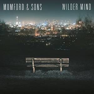
You’d be surprised how many bands fail in this aspect. They get so caught up in how the image looks and feels that they don’t even consider how it relates to the music. Consider the cover to the new Mumford and Sons album, Wilder Mind:

It’s nighttime. It’s a bench in a park overlooking a bright city. Okay, I’ll admit, this doesn’t look terrible. It’s dull, but it’s not a disaster. But what does it tell me about the album? Let me repeat: it’s nighttime. It’s a bench. In a park. Overlooking a bright city. No? Nothing? Yeah, me neither.
What about when bands get it right? Let’s revisit the previously alluded Animal Collective album, Strawberry Jam:

Ugly, isn’t it? A little disgusting, too. But there’s something fun about jamming strawberries, playing a few jams, and calling it Strawberry Jam. All this tells me that the album probably packs a punch of energy.
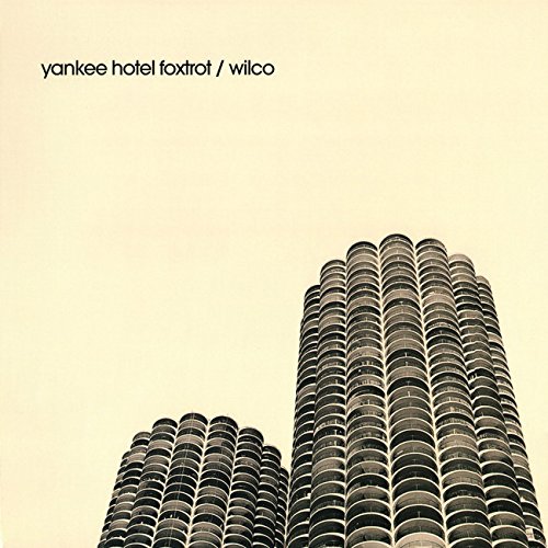
Having said this, certain album covers are harder to critique than others. These covers may be perceived as dull and uninteresting at first glance. It is when the listener is informed by the music that covers start to come to life and make sense. Consider Yankee Hotel Foxtrot by Wilco and xx by The xx:


The former features a curious duo of corncob-shaped buildings towering a beige-coloured sky. The latter features a big, bold, white ‘X’ sitting atop a black background. Both these covers have something in common. Look at how the focal point of each cover informs the space around it, the negative space. You could argue that this space has a stronger emphasis than the focal point itself.
What can this possibly tell you about these albums at first glance? Not much, to be honest. However, it is when one listens to Yankee Hotel Foxtrot and xx that they start to understand. As it turns out, xx quite possibly has the most fitting cover it could have. The music is minimalist to the point where the silence that sits between beats serves as the band’s greatest instrument in its own right. Silence, non-focal, negative. Looking at the cover after a listen, you would see why The xx chose such a simple cover. Yankee Hotel Foxtrot is not a minimalist album, but the music has moments between the fun alternative rock songs that cause us to slow down. To consider something more, to maybe even look out of the TTC bus window, and to each time one of those songs pop up, I look back to the cover and totally understand its purpose.
I don’t have all the answers. A cover that has no meaning to me may have all the meaning in the world to another person, and so art moves on. But hopefully you now have an understanding of why judging a book by its cover can be completely understandable.
Sorry, mom.
Alexander Colle, Contributor
Featured illustration by Christopher Lai, Comics and Graphics Editor
In text images courtesy of Universal, Young Turks, Reprise Records, Domino


